Redesigning Crunchbase
UX Design | User Experience Design | Web Design
My Role
UX Lead — Interaction Design, Visual Design, User Flows, Rapid Prototyping, Business Model
Team
Sarah Cianciola
Yan Tian
Parnian Vafa
Wendy (Wenqing) Yin
Timeline & Status
3 Months, Launched in September 2023
Design Challenge
Client - Crunchbase
Project Summary
Crunchbase provides real-time insights for sales, leadership, and VC professionals, helping various roles engage with qualified accounts through personalized recommendations, advanced search, and detailed analyses of team dynamics, growth trends, and investments.
The aim of this project is to redesign the site to transform Crunchbase from just a data provider to a user-centric platform offering personalized and accessible data, with a better visualization to increase user retention rate.
The current problem is that Crunchbase isn't fully leveraging new tech to boost its search and visuals. There's outdated data since companies self-update, and essential info is often behind paywalls, limiting access for entrepreneurs and small investors.
So, how might we provide Crunchbase a way to incorporate accessible and personalizable data visualizations in the user interface to boost efficiency and startup founders’ use of Crunchbase?
Problem Space
Target Users
Our target users in this project are the startup founders. We identified the behavior of interests from the following:
What do they do on Crunchbase (context of use)?
What features/functions they use or not use?
Why they use or not use?
What they hope CB can provide?
Stakeholders
Main Features
Crunchbase, known for its extensive data, often presents a challenge in use- intuitiveness, particularly for startup founders- one of their more niche user groups.
To address this, our focus was on integrating more user-friendly and customizable data visualizations into the interface, enhancing startup founders' efficiency in obtaining information.
Onboarding
We designed an intuitive, step-by-step onboarding process for users to enter key information with the goal of collecting data to customize each user’s homepage.
Customizability - Homepage
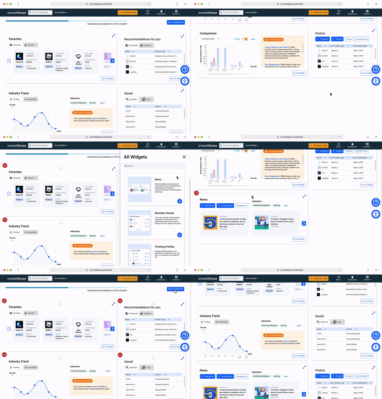
Our user-customized homepage offers key widgets like Favorites, Recommendations, and Industry Trend, ideal for startup founders.
We've enhanced accessibility by adding a floating icon for tools like screen readers and color options for inclusivity.
Users can customize their experience by adding, removing, and rearranging widgets to meet diverse needs efficiently.
Multiple depths of information
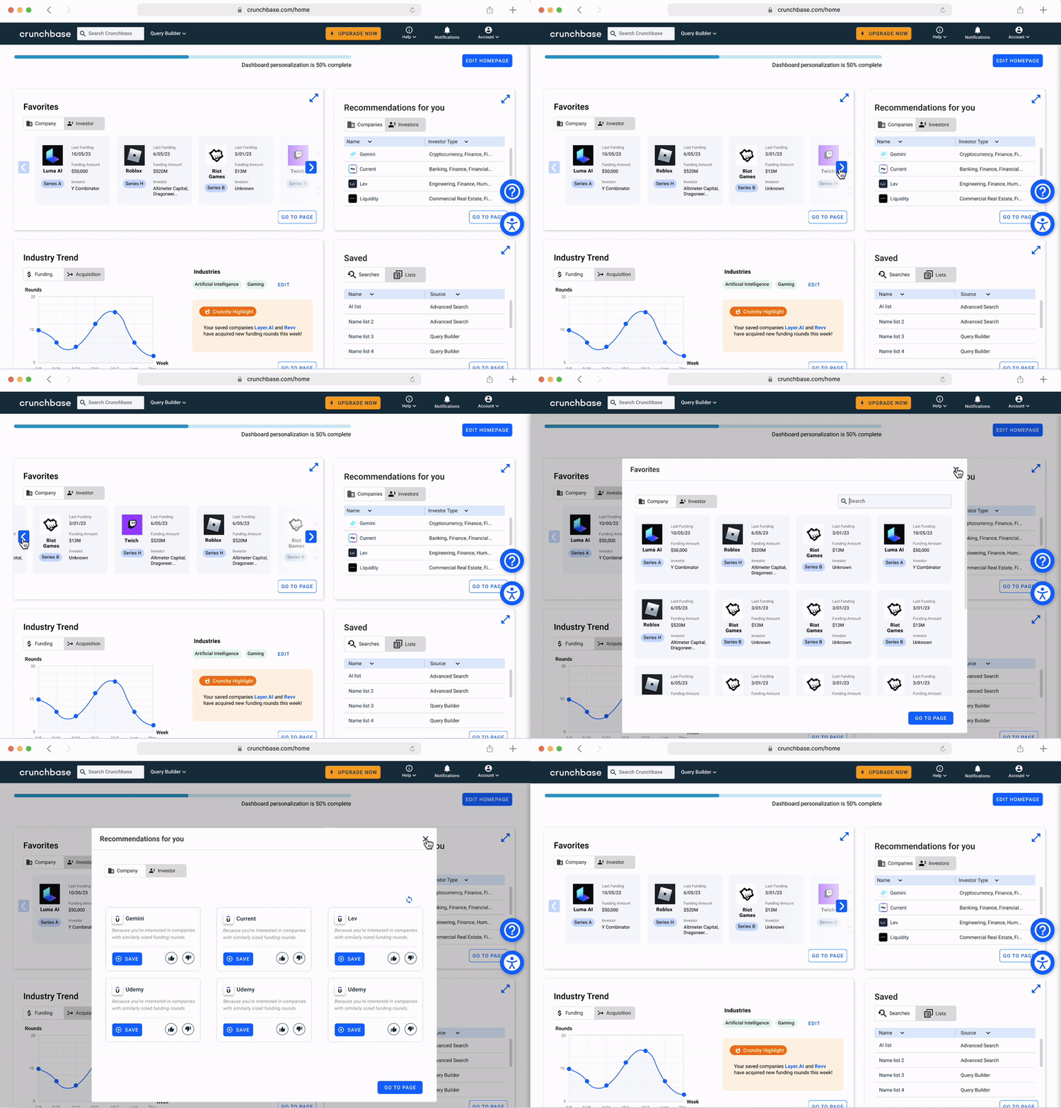
We designed different views with various amounts of, and complexity of information, targeting users with diverse needs and preferences.
Interactive widgets
These interactions within the widgets streamlining information access, enable users to rapidly view pertinent details without the need to navigate to specific pages.
“Comparison” - Feature
We showcased the user flow with the Comparison widget by designing a detailed page and interactions, adding a filter feature to the detail page to minimize information overload and enhance user specificity.
Research Method
Surveys
we received 21 responses, 12 left after the screening. The goal of the survey is to understand target user's background traits, their prior experience with information-searching platforms, and their experience with Crunchbase.
The survey gave us an overview of the problem and user traits, guiding our interview questions.
Interviews
The second method we conducted was the interview. We conducted 4 interviews in total.
The goal is to identify growth opportunities for Crunchbase by understanding startup founder’s needs and usage patterns. To examine their crunchbase account types, current tools, and how these insights can enhance crunchbase data visualization.
We used Dedoose Coding to analyze the scripts.
Competitive Analysis
Our objective is to explore how other platforms support startup founders in finding their goals, pinpoint areas for Crunchbase to bolster its market edge, and assess the platform from a business standpoint, supplementing our other research approaches.
We compared five different platforms: PitchBook, CBInishgts, Apollo, LinkedIn, and Crunchbase.
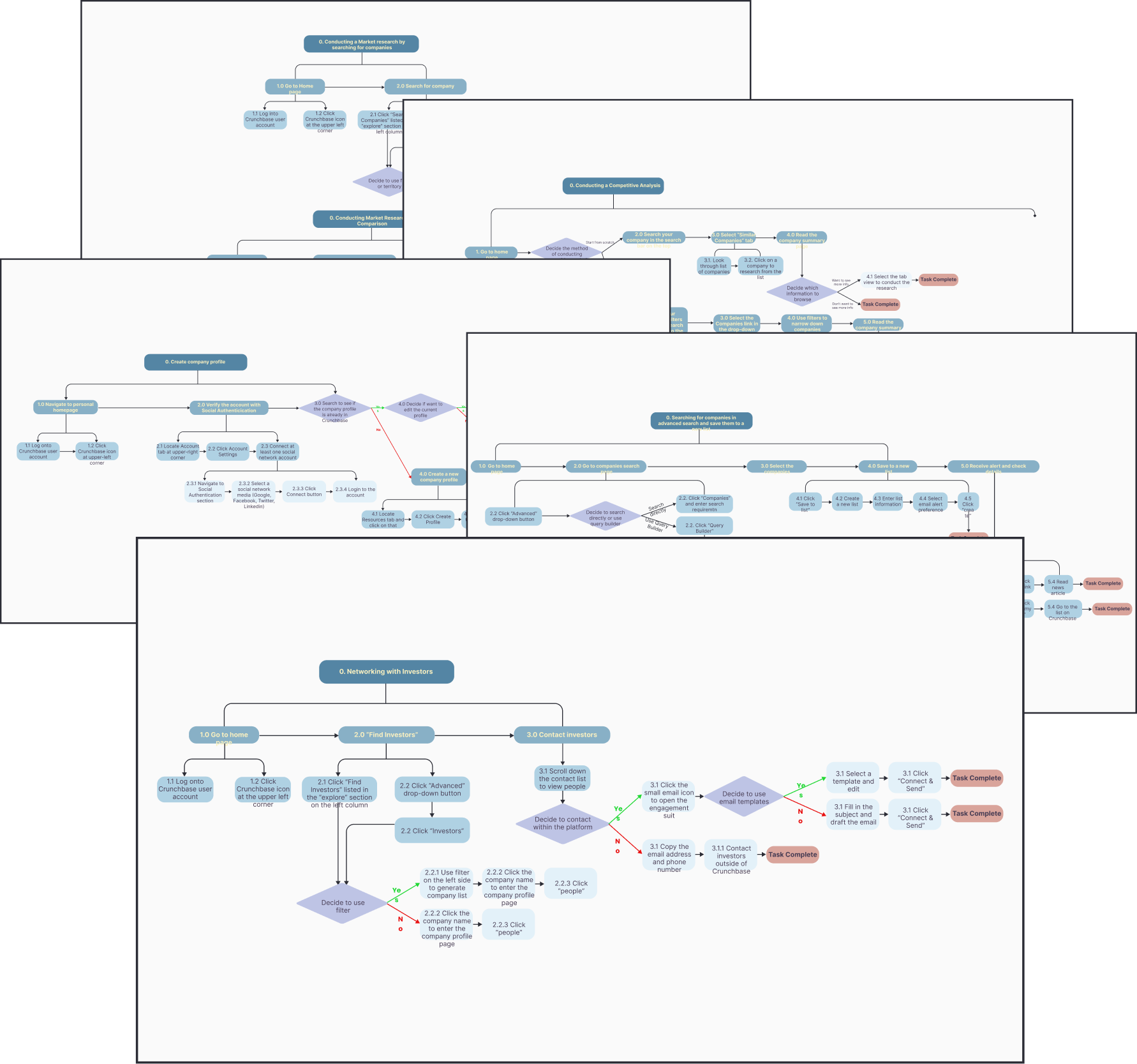
Hierarchical Task Analysis
The main goal of conducting task analysis is to determine startup founders' tasks on Crunchbase and how they reach their objectives. To identify user pain points and areas of confusion and to evaluate the overall user experience.
We decided on five main features that startup founders use the most:
Networking with investors
Searching for companies in advanced functions and saving to new lists
Creating company profiles
Conducting competitive analysis
Conducting market research
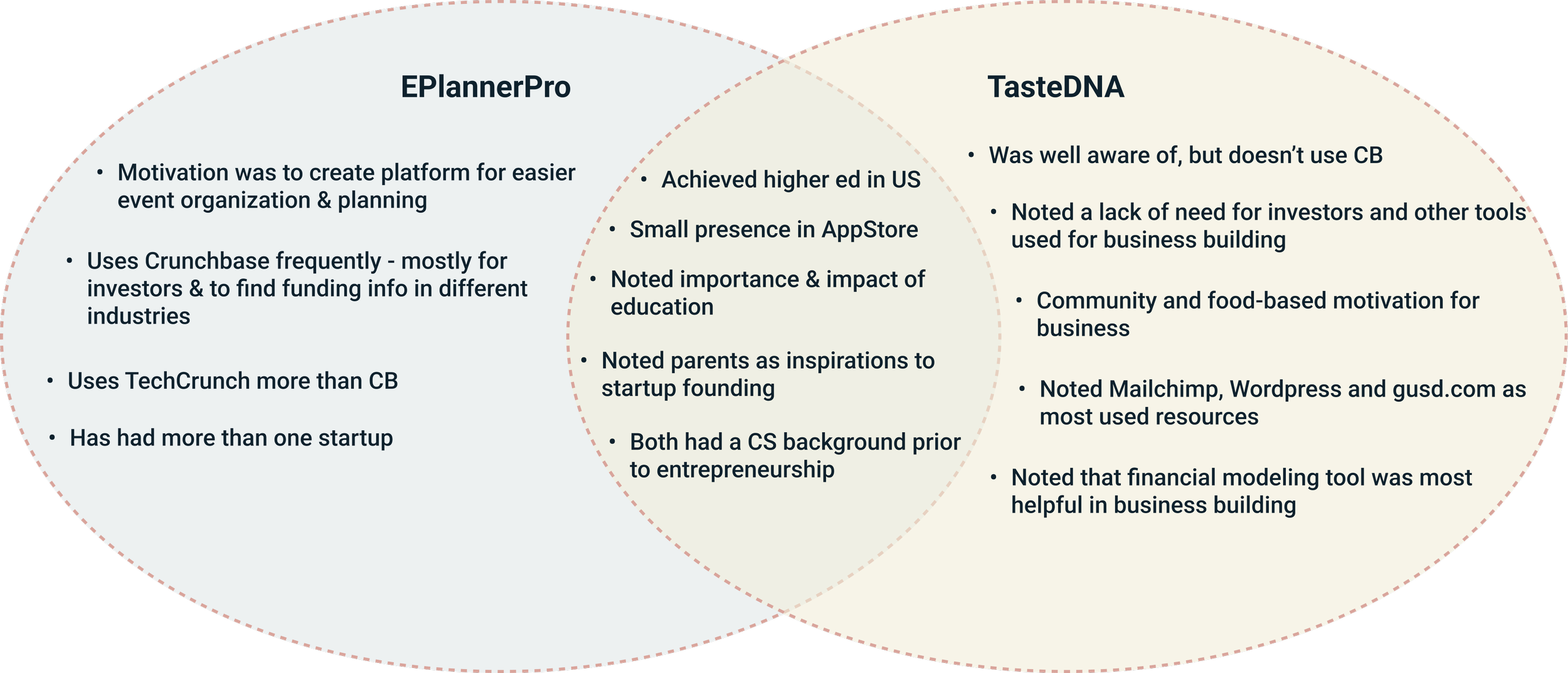
Ethnographic Research
Lastly, we conducted ethnographic research. We attended a startup event and interviewed three startup founders.
The aim is to grasp startup founders' needs, Crunchbase usage, and reasons for targeting them; explore their backgrounds and tool preferences; and determine why they choose or bypass Crunchbase, evaluating its user value.
Through the comprehensive and summary table, we identified three strategies.
Strategy one:
To strengthen its advantage, which is to strengthen the evaluating investors feature, enabling easy comparison between investors.
Strategy two:
To improve current features, which include searching for investors, reaching out to investors, and searching for market and competitors.
Strategy three:
To introduce a new feature, the view market trend. There is a need to provide users with an intuitive way to understand the market trends.
Through the task analysis, we identified the major pain points from three different perspectives, data visualization, information, and experiences; and we identified the opportunities that helped us derive the design implications in the later stage.
Insights
We synthesized our findings into two main categories, the user experiences on crunchbase and the business needs. There are subcategories under each which are color-coded for clarity.
Ideation
From our findings, we identified 9 user needs and core design implications, shown in the table.
Based on the design implications, we created artifacts (one persona and two user journey maps) to help us dive deeper to understand user needs.
Persona
The persona is created as a realistic representation of our key audience segments for future reference. To help us understand users’ needs, experiences, behaviors, and goals as shared knowledge.
User Journey Maps
The maps provide a holistic view of the diverse interactions and touchpoints involved, revealing the pain points and gaps that can become opportunities for improvement and innovation. We categorized it into two main tasks.
The first one is identifying potential investors, from researching investors to evaluating, connecting, and finally receiving the funds.
The second task is to understand the market and competitors, from the needs to understand the market, conduct research, compare, and make strategic decisions.
Conceptualization
To elevate Crunchbase's user experience, we plan to introduce a virtual tour, improve graph visuals, and enhance multi-company comparisons. We'll give sector overviews, especially for underrepresented areas. Prioritizing transparency and personalization, we'll upgrade search tools, enable interface customization, and refine comparison filters. Our end goal is a more intuitive, user-centric Crunchbase.
Wireframes
From our sketches and past interview insights, we understood the needs of startup founders based on their roles. We transformed these sketches into wireframes, focusing first on homepage information. Each of us then developed a widget for a feature and its associated pages.
Usability Testing
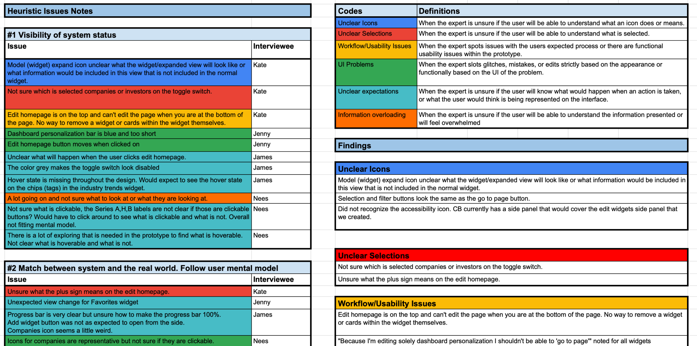
We tested the product at various stages of the project.
Sketches - Testing
We conducted only two interviewers who were startup founders; due to difficulty finding people in our target user. Each session lasted around 15 min with teammates present.
During our feedback session, we asked general questions about the 3 design concepts to see:
Where problems lie & where we can build off the designs
What the users liked or disliked about the concepts
How they would think they would use the concepts
How they would like to personalize the homepage
Low-fi - Testing
We conducted feedback session with two interviewers who were startup founders and three designers at Crunchbase, each lasted 30 minutes.
During our feedback session:
We asked general questions about the home screen, widgets, and layout
We sought users' first impressions
Checked if the content met founders' needs
Tested the redesigned widget concept with data visualization
Usability Testing
We did a total of 11 interviews
4 expert users
3 target users for the first round
Went back and did a second round with 5 users
Analyzed both qualitatively and quantitatively


